
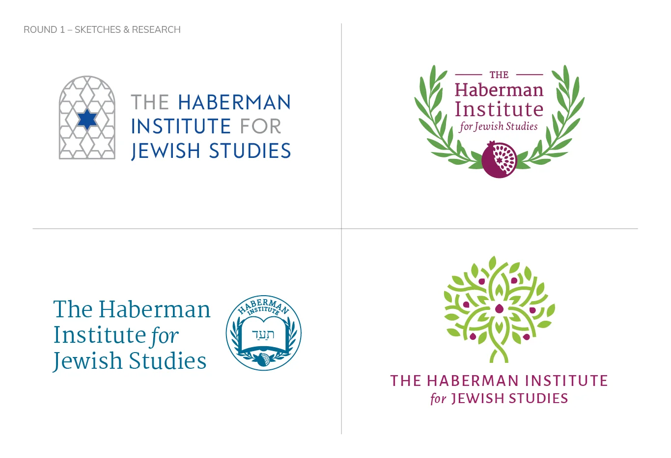


The Foundation for Jewish Studies, a long-standing institution for adult Jewish learning in the DC area, changed its name to the Haberman Institute for Jewish Studies in 2018. With a new name, the Institute needed a new logo. The client wanted the new mark logo to reflect the Jewish faith and culture without becoming stereotypical, and contemporary without being so ‘modern’ that it would not reflect the traditions and identity of its members.
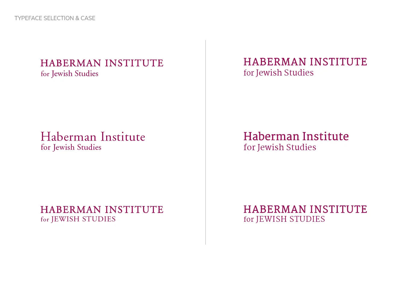
During the research phase, I identified several key symbols to focus on in the mark. While the Star of David is the most iconic Jewish symbol, the client did not want it to be the primary focus. I tried several combinations of symbols, patterns and logotypes until the Tree of Life emerged as the favorite. With minor tweaking, the Star of David was reintroduced in a subtle way that did not interfere with the overall design. A serif typeface was chosen to allude to the traditional elements of the Institute.
Client: Haberman Institute for Jewish Studies
Studio: Comella Design Group